Case Studies
These projects show how I work on complex digital products:
understanding what is really broken, clarifying messy workflows, and
designing solutions that are both usable and realistic to implement.
Rather than presenting a textbook design process, these case studies
focus on the substance of the work — legacy systems, information
architecture problems, multi-role workflows, product constraints, and
the decisions that turned those into clearer experiences. Across
different domains, the pattern is the same: identify the structural
problem, simplify it, and move the product forward.
1 · Hibernia College - Redesigning a legacy learning platform
within Moodle constraints
2 · Adaptemy - Designing an education platform for complex
assessment workflows and learner needs
3 · Deanta Global - Clarifying critical workflows in a complex
publishing operations platform
1 · Hibernia College - Redesigning a legacy learning platform within Moodle constraints

Introduction
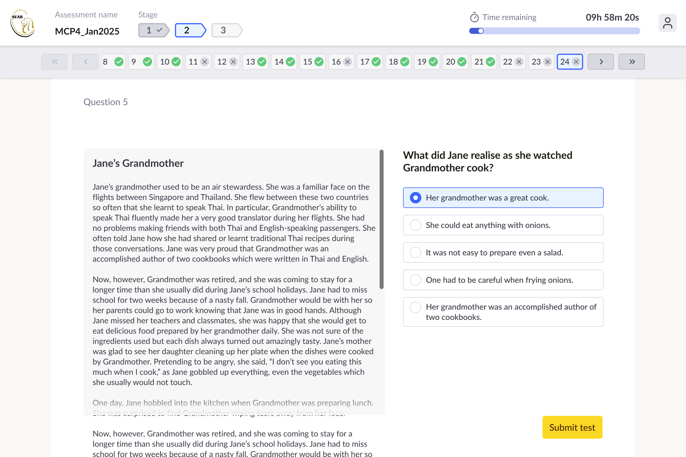
This was one of the biggest and most rewarding projects I’ve worked on. Hibernia College’s virtual learning environment had grown old, fragmented, and difficult to use, with parts of the experience shaped by over a decade of accumulated structure and Moodle constraints. Navigation was deep, journeys were confusing, and the way learning content was organised no longer matched the real academic programme in a way that made sense to students. I was brought in to help rethink that experience from a UX and UI perspective. The work was not about rebuilding the platform from scratch, but about understanding where the real friction lived and finding smart structural solutions within the limits of Moodle. That challenge — improving a complex legacy system without the freedom of a greenfield product — is exactly the kind of design problem I enjoy most.
The Challenge
Hibernia College’s virtual learning environment was central to the student experience, but the platform had become outdated, difficult to navigate, and poorly aligned with the actual structure of the academic programme. Parts of it were more than 10 years old, and the experience felt shaped by Moodle’s default logic rather than by how students actually learned. The information architecture was too deep, common tasks required too many steps, and users often had to move through confusing cross-page links just to reach important areas. The structure of the platform also did not reflect the real-world programme and module structure clearly enough, which made the whole experience harder to understand and trust. The challenge was not just to modernise the interface, but to make a Moodle-based system feel much more intuitive and much more aligned with how students and staff actually used it, while still working within the limits of the platform.

Design Approach
1. Finding where the real friction was
I started with heuristic analysis, then expanded that through student interviews, observation sessions, and Matomo analytics. That gave me both a structural and behavioral view of the platform: where users were getting lost, which parts of the system mattered most, and where the existing information architecture was failing them. A clear pattern emerged from the research. Students spent most of their time in a small number of core areas, but the product did not reflect that priority. Instead of leading them toward the places they actually needed, the system exposed Moodle’s internal structure and content logic.


2. Translating research into a clearer navigation model
Once I understood which areas mattered most, the next step was to turn that into a more usable structure. One of the first major decisions was to introduce a new sidebar navigation that mapped the most important destinations directly to top-level menu items. This was a structural change, not just a visual one. The goal was to reduce dependence on Moodle’s default pathways and reorganise the experience around what students actually needed to do. I used the research synthesis to map real user priorities directly into the new navigation model.
3. Creating new entry points within Moodle’s constraints
A deeper challenge was that Moodle did not provide the kind of dashboard-style home page the product needed. Students needed a clearer starting point that reflected their real programme structure, not just Moodle’s internal organisation. My solution was to introduce a new Study Now page that acted as the real home page of the learning experience. It showed the modules that made up the student’s programme and created a much stronger match between the academic structure and the digital one. Underneath, this relied on adapting and reusing Moodle structures rather than inventing a whole new system. A similar challenge appeared inside modules. We needed to present not only actual curriculum courses, but also other destinations such as assessments, live events, discussions, documentation, and module information. To solve that, I reused the same underlying card logic but styled and structured it so different destinations felt distinct to the user. That let us create the Module Hub experience without requiring entirely new underlying objects. This was one of the most important parts of the redesign: finding structural solutions that felt like new product experiences, while still remaining practical within Moodle’s limits.


4. Validating the new structure
After restructuring the experience, I tested the new flows and prototypes with students. The aim was to check whether people could now find the same destinations and complete the same kinds of tasks more naturally than before. This was important because the redesign was not just about cleaner screens. It was about making the platform more logical. Testing helped confirm that the new navigation, module structure, and entry points matched student expectations much better than the old system.
5. Refining the interface around user meaning
At the UI level, one important improvement was simplifying Moodle’s activity language and iconography. Moodle exposed many different system-level activity types, but from the student’s point of view those distinctions often did not matter. Students cared more about what kind of activity something was than what Moodle technically called it. So rather than keeping a large and overly specific icon set, I grouped activities into more meaningful categories and created a simpler, more modern visual language. This made the platform easier to scan and more consistent from the student’s point of view.
Outcome
The redesigned platform was easier to navigate, better aligned with the real academic programme, and significantly clearer for students and staff. Key user journeys were streamlined by 30%, accessibility improved, and the experience felt much more modern and coherent despite Moodle’s technical constraints. This project is one of the clearest examples of how I work at my best: understanding a messy, constraint-heavy system, identifying the structural problem underneath it, and designing solutions that feel simple to the user without requiring a full rebuild behind the scenes.
2 · Adaptemy - Designing an education platform for complex assessment workflows and learner needs
Introduction
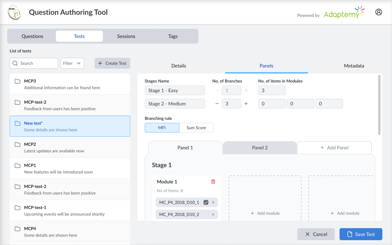
At Adaptemy, I worked on an adaptive learning platform that had to serve both its own core product vision and the very specific needs of education clients. That made the work especially interesting, because the challenge was rarely just to add a feature. More often, it meant understanding a client’s existing model, content structure, or assessment process, then finding a way to make that work inside an existing platform without turning the product into a patchwork of exceptions. One of the strongest examples was work for SEAB (Singapore Examinations and Assessment Board), where the platform had to support large-scale assessment authoring, sessions, and analytics. My role was to help translate that complexity into product logic and workflows that were clear, usable, and realistic to implement.
The Challenge
Adaptemy is an adaptive learning platform, but some of the most interesting work came from adapting it to support client-specific educational models that were more complex than the product’s original structure. A strong example was SEAB, which needed to create, manage, and analyse large volumes of assessment content for national student testing. The challenge was not simply adding new screens. SEAB already had established ways of working, and those workflows did not map neatly onto Adaptemy’s product model. They needed to manage both reusable tests and specific yearly sessions, structure large numbers of questions, and capture results and analytics at the right level. At the same time, the product still had to remain coherent for learners, educators, and internal teams using the platform more broadly. So the real problem was both structural and experiential: how do you extend an existing product to handle more complex assessment logic and client workflows, without turning it into a confusing or inconsistent system?
Design Approach
1. Understanding the workflow and translating it into product logic
The first challenge was understanding how SEAB actually worked. This was not just about interface requirements. It meant understanding their content model, their assessment process, and the relationship between different objects and workflows inside the system. A key example was the distinction between tests and sessions. A test behaved more like a reusable template, while a session was a specific yearly rollout of that test to a real cohort of students and schools. Results and analytics needed to happen at the session level, not just the test level. Adaptemy already supported tests as data objects, but not this relationship in the way SEAB needed. My solution was to reuse the existing test model rather than inventing a completely separate system. Tests became the source templates, sessions were generated from them, and the link between the two was preserved. That gave the client the structure they needed while also making implementation much more practical for the backend team.
2. Making complex authoring workflows usable
Once the model was clear, the next challenge was turning that complexity into a usable product experience. SEAB needed to create and manage thousands of questions, so the workflows around authoring, structuring, and editing content had to feel manageable rather than overwhelming. A big part of the design work was deciding what should be visible in different contexts. Some details made sense on a live session but not on the reusable source test, so the UI needed to reveal or hide information depending on what the user was doing. We also designed the workflow so that if authors found a mistake during the session setup stage, they could go back to the linked source test, correct it there, and let the update flow through where appropriate. This was the kind of product work I enjoy most: taking something structurally complicated and finding a way to make it feel logical in the interface without oversimplifying the real process underneath.
3. Extending the platform while keeping the learner experience coherent
My work was not limited to assessment tooling. I also worked more broadly across Adaptemy’s student-facing platform, helping improve the learner experience and polish the UI so the product felt clearer and more coherent overall. That meant balancing multiple perspectives at once: client-specific workflows, platform logic, educator/admin needs, and the learner-facing experience. As the platform expanded to support more complex use cases, part of my role was making sure it still felt like one product rather than a collection of disconnected features. This combination of deeper structural work and interface refinement was important. It meant the platform was not only more capable, but also easier to understand and more pleasant to use.
Outcome
The result was a more flexible and capable platform that could support both Adaptemy’s core adaptive learning experience and more demanding client requirements. In SEAB’s case, that meant clearer workflows for handling high-volume assessment content, reusable tests, live sessions, and related analytics. More broadly, the work helped extend the platform in ways that were grounded in real educational needs while keeping the learner experience coherent and well designed. For me, this project is a strong example of product design as translation: understanding a complicated real-world process, finding the structural problem underneath it, and then designing a solution that works for users, platform logic, and implementation at the same time.
3 · Deanta Global - Clarifying critical workflows in a complex publishing operations platform
Introduction
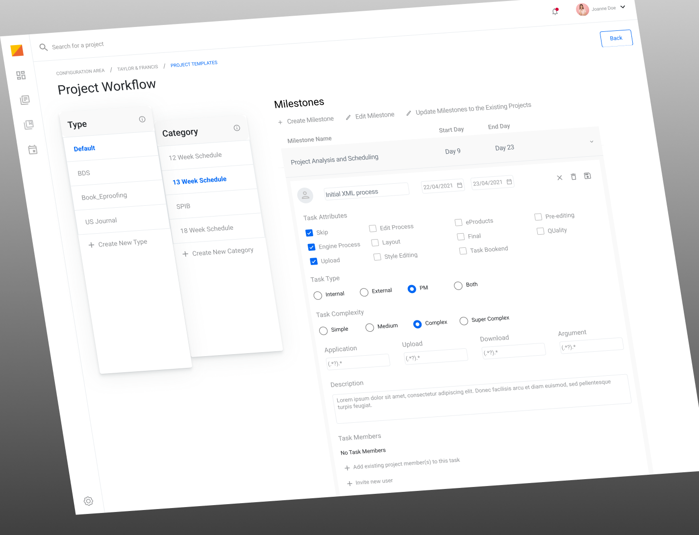
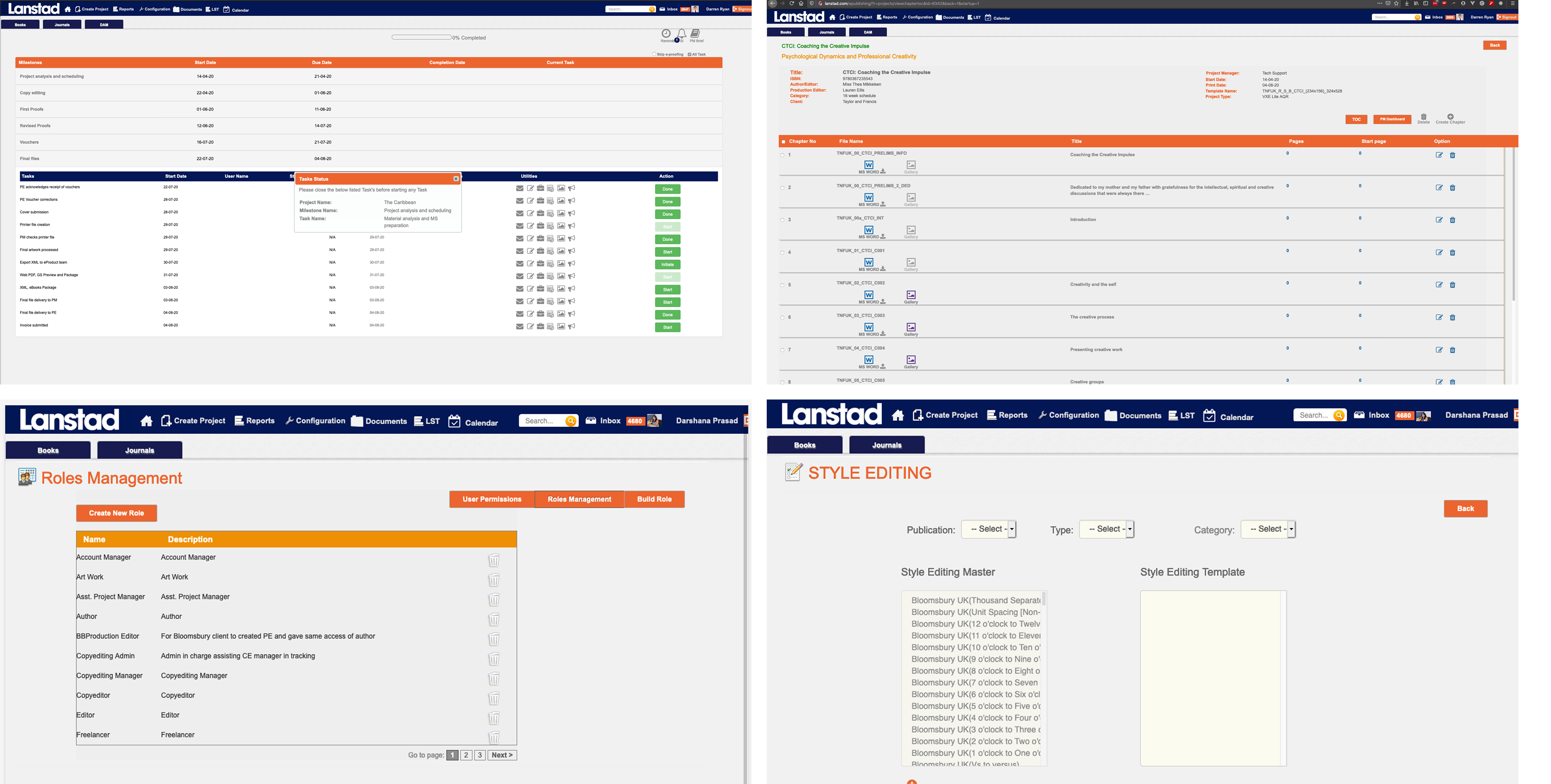
Deanta Global’s platform was built around the publishing process, which meant it had to support a surprisingly large and complex network of roles, handoffs, assets, approvals, and operational decisions. By the time I joined, the redesign had already started, but the product was still difficult to understand both as a user experience and as a system. That made the project less about surface-level redesign and more about learning a dense real-world workflow quickly enough to improve it responsibly. My role was to help bring clarity to some of the platform’s most important workflows, especially around project setup, asset flow, and the broader operational structure. It was a classic complexity problem: not simplifying the reality itself, but designing a product that made that reality far easier to navigate.
The Challenge
Deanta Global’s platform supported the publishing process from start to finish, across books, journals, contributors, approvals, assets, and production stages. It was a large and complicated operational product with many different user roles involved, including authors, artists, editors, proofreaders, project managers, and client-side teams. The difficulty was not just that the UI looked old. The platform itself was hard to understand. Work moved between many people, with dependencies, handoffs, reviews, and waiting points across the publishing pipeline. Even as a designer joining the project, it was difficult to build a clear mental model of how the workflows actually functioned. I did not start the redesign from scratch. Another designer had already begun work before leaving, and I inherited the project. My focus became understanding the most important workflows and helping bring structure to some of the most critical parts of the platform, especially around project setup, workflow configuration, and the broader asset-management logic that sat at the centre of the publishing process.
Design Approach
1. Finding where the real friction was
The first challenge was simply understanding the domain well
enough to design responsibly. This was a product built around a
real publishing workflow, not just a generic admin system, so I
had to understand how work actually moved between roles and what
each stage required. To do that, I worked closely with
stakeholders and account managers, including people with
publishing experience who could explain how the real-world process
operated.
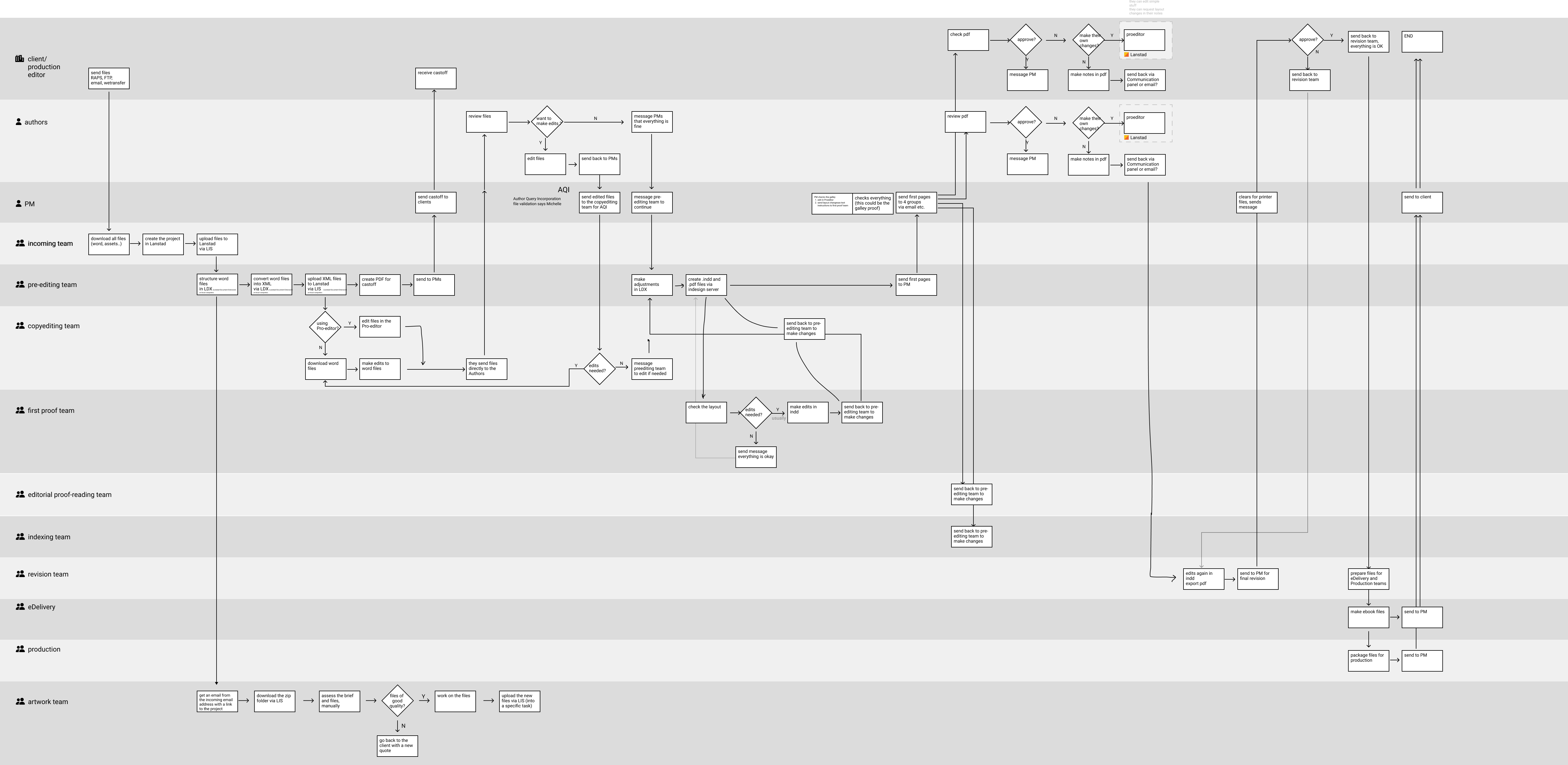
A big part of my process was mapping the workflow in detail. I ran
workshops, asked a lot of clarifying questions, and used those
conversations to build increasingly clearer workflow maps. The
first maps were messy by necessity: they captured the density of
the system, the number of roles involved, and the many
dependencies between people and tasks. From there, I refined that
understanding into a more structured swimlane view that made the
relationships between roles, assets, and project stages easier to
reason about.
That mapping work was important because the product’s complexity
was not accidental. The publishing process really did involve many
contributors and handoffs. The goal was not to flatten that
complexity into something fake, but to make the platform reflect
it more clearly and support the people managing it more
effectively.
My main contribution was in the workflows around setting up and
organising projects inside the platform. That included thinking
through how client teams and operational users structured
projects, configured workflows, handled users and permissions, and
moved assets through the broader publication process. The redesign
focused on making those critical operational flows easier to
follow, more coherent, and more practical to use. From there, I
translated that structural understanding into a cleaner interface
and more modern interaction patterns. The value of the redesign
was not only visual polish, but making a difficult operational
product feel more legible and more intentional.
Outcome
The result was a clearer and more coherent experience across some of the platform’s most important workflows, particularly around project setup, asset flow, and operational structure. The redesign helped modernise a very outdated product and made it easier to navigate and reason about a system built around many roles, dependencies, and moving parts. For me, this project stands out as one of the best examples of product complexity in my career. It was not just about making an old platform look better. It was about learning a dense real-world workflow, mapping it properly, and designing a more understandable system around it. That is exactly the kind of challenge I enjoy most.